Business cards make a statement. If you’re giving someone your business card, odds are this is the first thing they are seeing of your company. You want to make a good impression.
If you want to make sure you produce professional-looking, top-quality business cards, here are some simple steps to help you design your own to be custom printed!
What should go on my business card?
Your business card should remind a person of meeting you, and if they are interested they should be able to get in touch.
The minimum information you should have is:
- Your Company name
- Website
- Your name,
- Job title,
- Phone number,
- Email address.
If you have enough room and it is relevant, you can also include:
- Social media handles
- A tagline
- Logo
Remember you can use both sides of your card but it is still a small area, you don’t want to overcrowd the card but make sure all the right information is there.
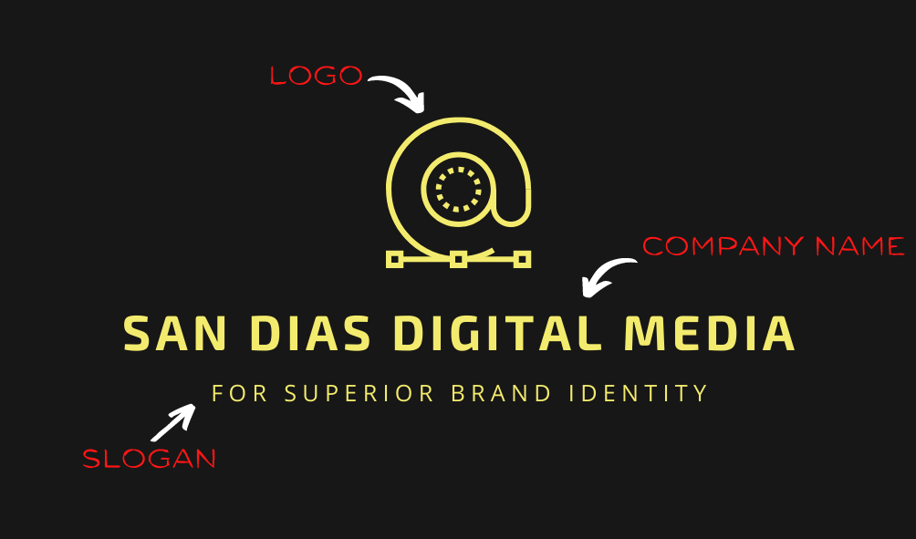
Front (Example)
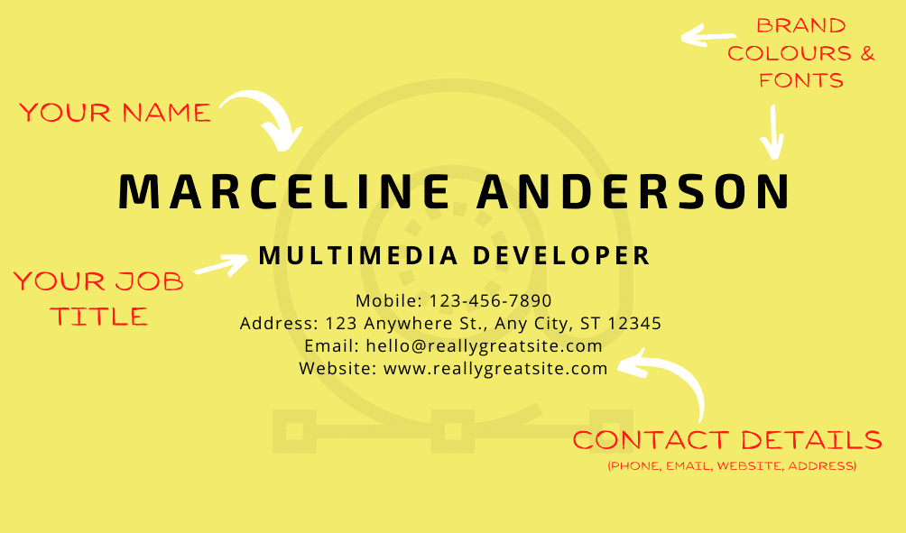
Back (example)
Personal touch
If you feel comfortable enough, putting a photo of yourself on your card will make you more personable. It’s a great way for people to remember you as an individual. When people try to contact you, they will be able to put a face to the name.

Example of a photo business card!
Set your budget
There are a few things to think about when setting your budget:
- How many do I want to print?
- When/where will I be handing these out or placing them?
- Will I be sending them out with delivery orders?
- Will they be handed out at important meetings?
- What kind of finish do I want my cards to have? (i.e. matte, smooth)
The answers to these questions will help determine how much you will ideally spend on business cards. If you need to do an estimate, fill in your details on our business cards product page to get a quote.
What is it going to look like?
The fun part is designing your card!
Try to stick to your branding, or if you haven’t established your branding yet, make some branding guidelines. These should include:
- Logo
- Fonts
- Colours
- Slogan
- Illustrations
- Mission statement
Try not to let images outshine your contact details, you want it to look good, but adding your logo and colour scheme should be enough to brighten it up. The information is the real star of the show.
Text-wise, it is important to select fonts that will be eye-catching, but also legible. Make sure the font reflects your brand’s identity, whether that be classic, minimalist, or artsy. Fonts don’t just communicate the words, they also reflect your company’s vibe and values.
If it’s your first time designing your business cards we have lots of templates to choose from and an in-house design team to help you!
An example of branding. See how the colours, fonts, and illustrations reflecting her style.
What do I do once I am happy with my design?
Once you are happy with the way your business card design is looking simply place your order on our website. Make sure you upload your design as a PDF. We will make sure the finished product is high-quality and printed on 350gsm card.
If you need help designing your cards, talk to our friendly design experts by calling 0800 437 016 or email us at [email protected].

